

A great sign can bring in customers for years. A poorly planned one can be expensive to fix. After many years of designing and installing signs around Melbourne, these are the mistakes we see most often — and how to avoid them.
1. Trying to say too much
Long lists of services, multiple phone numbers and small text make a sign hard to read. Focus on your name, what you do and one key message.
2. Lettering that is too small
Text that looks fine on a computer screen can be unreadable from across the road. Size your lettering for the real viewing distance.
3. Low contrast colours
Light grey on white or dark blue on black might match a mood board, but they disappear outdoors. Strong contrast is essential for readability.
4. Choosing materials only on price
Cheaper materials can fade, crack or peel quickly in the Australian sun. The cost of replacing them early is often higher than investing in quality from the start.
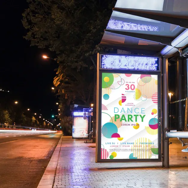
5. Forgetting about night-time
If customers drive past after dark, an unlit sign is effectively invisible for part of the day. Consider illumination during the design stage.
6. Ignoring approvals
Some signs need council or landlord approval. Checking early avoids delays or having to modify a finished sign.
7. Inconsistent branding
Your shopfront, vehicles, printed materials and website should all look like the same business. Consistency builds recognition and trust.
Want a sign that gets it right the first time? Contact Sign Expertise for practical advice and a clear quote, or browse our project gallery for inspiration.